There is nothing more synonymous with sports organizations than their logos. They are on jerseys/sweaters, fan apparel, and in the center of almost every arena and stadium. Whenever you think of any team, it doesn’t take long for its respective logo to pop into your head as well. The WHL, like all other leagues, has its fair share of fantastic, mediocre, and poor logos. Some are simplistic, while others are elaborate. Some connect easily with the team’s name, while others are hard to grasp.
Determining the WHL’s best and worst logos is ultimately a subjective task. The list composed below is one individual’s opinion on each logo’s style and relevance. Disagreements are not only welcomed but encouraged.
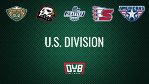
22. Portland Winterhawks

It is challenging to provide a high ranking to any logo that is not original. Portland’s logo is the same image the NHL’s Chicago Blackhawks use, giving the team zero points for creativity. The replication of the logo is not random. The first Winterhawks team wore old Blackhawks jerseys given to them by Chicago. Still, the “hand me down” history does little to move Portland in the ranking. Of course, there is also a great deal of conversation regarding whether the logo itself should be changed. If they were to take more of a “bird” approach to the logo, similar to their alternate from the 2019-20 season, there is a good chance the Winterhawks move up that ladder in the WHL logo world.
21. Kelowna Rockets
![]()
Kelowna’s logo looks like it belongs in the front of a children’s play center, where they serve frozen pizza and lukewarm hot dogs. It is uncertain which low-budget 90’s cartoon the dragon/dinosaur came from, but that is where it should have stayed. A little creativity credit might be given if they were working with a challenging team name; however, one would imagine that there are a lot of quality designs involving Rockets out there.
20. Moose Jaw Warriors

Moose Jaw is another organization that is considering a change to its current logo. Intending to keep this light-hearted, it is hard to give the Warriors logo much love regardless of where you stand. The font is fun, but the quality of the image looks like something from one of those “scratch and draw” books. A name such as the Warriors comes with a massive amount of potential in regards to logo design. Moose Jaw is even blessed with a magnificent-looking animal in its name if the team wants to go a different route in the future.
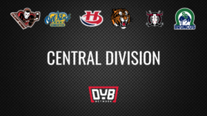
19. Lethbridge Hurricanes

Lethbridge falls victim to being a part of a league with some great logos. There is not a whole lot going on here, making the emblem mediocre at best. To their credit, the weather is a tough topic to work with unless it is something obvious like lightning.
18. Spokane Chiefs

Spokane’s logo falls into a similar category as Lethbridge’s. Letter logos do very little for this particular writer. Of course, it receives a slight bump above Lethbridge due to its attempt to blend two letters into one, and the letters are completely visible.
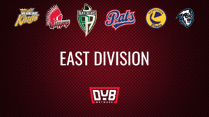
17. Regina Pats

Regina keeps it simple with its logo. The fancy cursive “Pats” is far from an eyesore. At the same time, it is challenging to rate it too high. The emblem is acceptable enough but lacks creativity. It’s “mediocre city” for Regina.
16. Saskatoon Blades
![]()
Saskatoon’s logo is in desperate need of an upgrade. At one point, it might have been neat, but now it looks like it belongs on a 70’s throwback sweater. Also, what’s with the two very different types of fonts? Cursive would work for both words beautifully.
15. Medicine Hat Tigers

There is no guessing needed in determining Medicine Hat’s team name. The tiger is well put together and radiates intensity. However, the logo is still missing something. Maybe a circle with the city and team name in it? Again, the Tigers fall victim to residing in a league with some great logos.
14. Edmonton Oil Kings

The Oil Kings logo looks as though it was created by a free graphic design application. It has all the necessary components of a great emblem; however, the quality of the image belongs more to a local auto parts shop than a WHL team. It’s another one that could use a slight upgrade. Sorry, Edmonton.
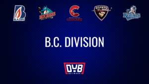
13. Kamloops Blazers

Kamloops’ logo is simple yet satisfying. The Blazers do not go over the top with flames. Instead, they place just one inside a “B,” and it works. Sometimes, less is more, and that is the case with this logo.
12. Winnipeg Ice

Winnipeg’s sasquatch-like character scores a hundred points in the terrifying factor. Of course, it is better than a plain old picture of ice. At the same time, it makes you go, “where did they get that from?” Similar to others, the logo would benefit from some words. A simple “Winnipeg” above the yeti with “ICE” below could go a long way.
11. Prince Albert Raiders

The Raiders logo is pretty darn cool. It fits in a lot without appearing overdone. The reality is that every logo from here on out is fantastic. Unfortunately for Prince Albert, that places them just outside the top ten.
10. Prince George Cougars

Prince George does a lot right with this logo. The blend of the cougar and the “C” is smooth and majestic. The “Prince George Cougars” below it brings it all together and makes it look complete.
9. Tri-City Americans

There are few things more “American” than Captain America. Tri-City does a great job making its logo a blend of the Marvel hero and Top Gun. The emblem fits the team name perfectly.
8. Brandon Wheat Kings

There’s just something about this logo. It’s like a perfect tattoo that gets the message across entirely but in a subtle fashion. Every aspect of the emblem goes together, and nothing seems out of place. Remarkably, it is simple and complex all at the same time.
7. Everett Silvertips

There is just something about bears and forest green that resonates with this particular writer. Throw in a mountain top and you have a sure-fire way of making it inside the top ten. Aside from the scripted “E” experiment, Everett knows how to put together a solid logo.
6. Seattle Thunderbirds

From the imagery to the color scheme, Seattle’s logo screams “Pacific Northwest”. The totem carving of the Thunderbird is synonymous with the native peoples of the area. Also, there’s a little homage paid to the Seattle Seahawks without it coming off as an exact replica. Seattle put together a nice piece of artwork that people would not mind putting on apparel.
5. Swift Current Broncos
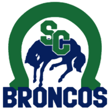
All of the images in Swift Current’s logo are incredibly simplistic with no details. Still, it 100% works and is one of the most complete logos in the WHL. The franchise could have easily taken from the Denver Broncos and put together something similar. However, they went their own way and put together a perfect crest to place on their sweaters.
4. Calgary Hitmen

The only way this logo could be any better is if Calgary found a way to get Bret Hart himself on it. There’s something about a Jason Voorhees character attached to what could be the cover of a 90’s video game that will catch the eye of everyone that comes into contact with it. This is a rare logo that never needs any tinkering.
3. Victoria Royals

If “Game of Thrones” had a hockey team, it would have this logo. Victoria truly nailed the “royal” look in a highly intimidating way. Just an altogether fantastic piece of artwork.
2. Vancouver Giants

There is something fun about the Vancouver Giants logo. The Paul Bunyan-like character wielding a hockey stick instead of an ax is the perfect presentation of a “hockey giant”. Throw in the red maple leaf and the ability to get the entire name in without it appearing forced and you really cannot get much better.
1. Red Deer Rebels

As mentioned at the beginning of this adventure, determining the best logo in any league is a completely subjective task. The WHL is jam-packed with some high-quality logos, making the selection of the best incredibly challenging. In order for one to rise above the other 21, something must stand out. For me, Red Deer’s emblem was the first junior hockey logo I ever came into contact with. I can remember being so visually pleased by what I saw and that mesmerization has stuck. They are able to put together so many great aspects into one piece of art, and it’s hard not to remember the crest on the sweater of the Rebels.