Matchup No. 11
Red Deer Rebels vs Seattle Thunderbirds
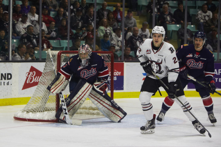
Red Deer Rebels

photos courtesy of reddeerrebels.com
MT – The Rebels handled the Hitmen fairly easily in the first round beating them by 23 votes, which was a tie for biggest vote margin in the first round. They are in for a much tougher battle in the second round.
Seattle Thunderbirds


photos courtesy of seattlethunderbirds.com
MT – A franchise that started in Vancouver in 1971 and had a brief couple years in my current town before settling in Seattle in 1977. Started as the Breakers and renamed the Thunderbirds in 1985. The blue, green, and grey colour scheme brings back memories of the Hartford Whalers (and I’m showing my age with that reference) and I think is one of the best colour schemes in sports. Nothing fancy with the jersey striping, they stick to the old fashioned arm and waist striping. The Thunderbird logo is one of my favourite logos in all of sports, not just the WHL. They have had the logo since the name change in 1985, the only change being removing the ‘Thunderbirds’ wordmark from above the logo. The incorporation of hockey sticks and Pacific Northwest First Nations art is just amazing and fitting for the location of the team. The shoulder patch for Kent is a nice touch for the location that the team actually plays in. This matchup will probably be closer than I think it will be, however there is a definite winner for me.
[yop_poll id=”22″]
Matchup No. 12
Moose Jaw Warriors vs Tri-City Americans
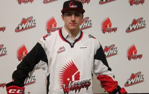
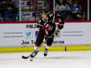
Moose Jaw Warriors

photos courtesy of mjwarriors.ca
MT – The Warriors started in Winnipeg in 1980 and moved to Moose Jaw in 1984. They sport the red, black, and silver as their colours. They’ve adopted the more modern piping on their jerseys, which I think fits very well. The black arms with silver and red underneath on the white jersey really looks nice and the thick white stripes from shoulder through chest and under arm on the black really stand out. Moose Jaw changed their logo four years after moving from Winnipeg to basically the logo that we know now. Aside from a change to the “Warriors” font in 1996 and a change in the colouring of that font in 2001, the logo has remained the same. Growing up I never did like the Warriors logo, I thought it was too “old” looking. As I get older I’ve become more fond of vintage logos in sports. There is something to be said about keeping a logo for a long period of time.
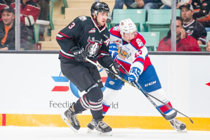
Tri-City Americans
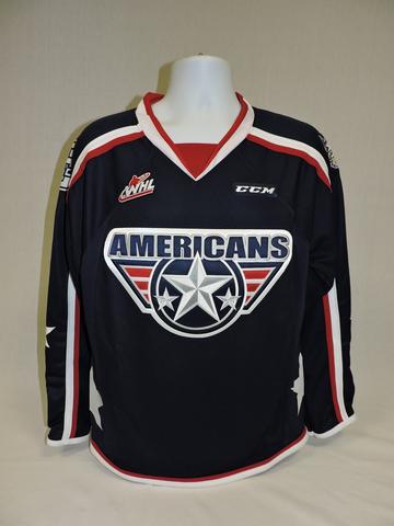

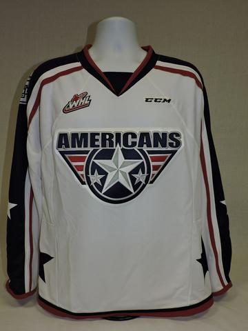
photos courtesy of amshockey.com
MT – The Americans got by the Regina Pats in round 1 by 12 votes, to me that was a bit of a surprise. Maybe not so much that they won, but that they won by that much. Apparently there are more fans of TC Americans jerseys than I thought. Enough fans to get them past the vintage logo of the Warriors?
Tri-City Round 1
[yop_poll id=”23″]
Last Week’s Results:
[yop_poll id=”19″][yop_poll id=”20″]