Last weeks results:
[yop_poll id=”2″]
Matchup No. 2
Brandon Wheat Kings vs. Swift Current Broncos
Brandon Wheat Kings


photos courtesy of wheatkings.com
Mike Trafford – I like the Wheat Kings colours. I’ll give them a pass on the black because yellow is such an under-utilized colour in sports. I really enjoy the lines on the white jersey with the yellow flowing down the arms. However, the black jersey just doesn’t take enough advantage of yellow. The small yellow patches are actually on the underside of the arm putting them in a much less visible spot. Brandon adopted their current logo, if we can call it that, in 2003 and went to full-on yellow the following year. To me it’s a wordmark, though, and not a true logo, so in that aspect they definitely lose points from me. The Wheat Kings have never really had a full-on “logo” since their inception in 1967, as everything has basically been a wordmark. The secondary logo on the shoulders of the black jersey would look excellent on the front of the jersey, though.
Paul Figler – The Wheat Kings were my original favourite WHL team. The current “logo” is exactly as Mike pointed out, a wordmark. I will say I do like the color scheme, as black and yellow do pair nicely. Not changing much to the jersey in the 50 years of the team does say a lot and I would say this is a classic look. Not the most intriguing but it certainly does remind people of the “golden” years of the team.
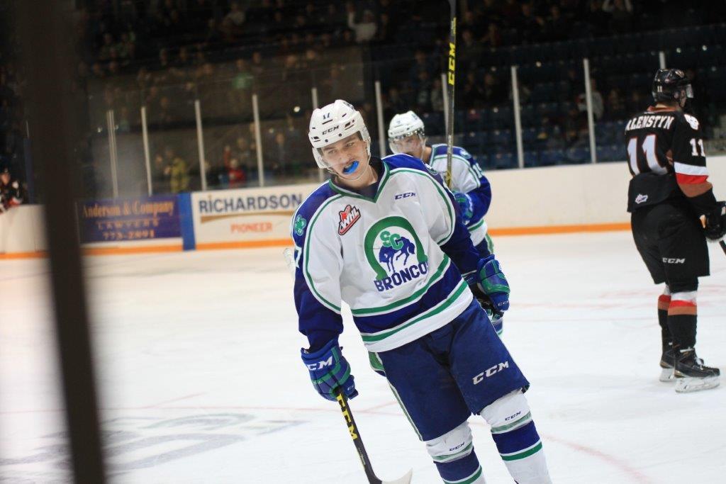
Swift Current Broncos


photos courtesy of scbroncos.com
MT – Swift Current has in my opinion one of the best colour schemes in sports. The blue and green is just perfect and the blue is dark enough to avoid having to use black. Nearly every aspect of the Broncos jersey just says old school to me. The straight running shoulder yokes that wrap around the wrists and the triple stripes and the base of the jersey are right from the ’80s. The Broncos reverted to an updated original logo two years ago, which also brought back green into the scheme, which was a great move. The previous logo, which had been used for 10 years, was by no means a terrible logo, but the original is just much better. I am, however, unsure of where and why the yellow came into play for their 50th anniversary logo. Yellow has never, as far as I can tell, been a part of their colours. If you do know the answer post in comments for me. Unlike last week’s matchup, this one has a clear winner for me.
PF – Old school is a theme in this match up. I’ve always been interested in the way the Broncos have combined green and blue. Not much you can do with a Bronco logo. They have changed the colour scheme with the yellow but I think it is just meant to draw attention to the 50th season. Not an awful look if you ask me. This vote will be close.
[yop_poll id=”7″]
Matchup No. 3
Red Deer Rebels vs. Calgary Hitmen
Red Deer Rebels


photos courtesy of reddeerrebels.com
MT – Red Deer has a very similar colour scheme to Prince George, although I do prefer their deeper more maroon red. Triple stripes on the arms and triple stripes on the base, simple look and it works. The Rebels have had no major changes to their jerseys in over 15 years and that says something for sure. They’ve also had their current logo coming up on 20 years. They made a big change in 1997 from a *insert negative adjective* skateblade wordmark to the almost pirate-like skull and crossbones (sticks). It obviously works as not many teams in the league have kept a logo this long.
PF – As a long time fan and follower of the Red Deer Rebels it would be unfair of me to gush about just how much I like the jersey. I’ll abstain from voting in this round as well.
Calgary Hitmen


photos courtesy of hitmenhockey.com
MT – It’s odd that these two teams got matched up in first round as their colours are fairly similar. Calgary did themselves a favour in 1998 and removed the pink from the scheme and slightly modified the logo. The Hitmen did a flip this year it seems of their home and away jerseys. Last year, if I recall, the white jersey had the mask logo and the dark jersey had the full logo, but someone will correct me if I am wrong. Calgary puts both logos on both jerseys, swapping them between shoulder and front. The logos fit the team name well and definitely draw on the wrestling background of original owner Bret Hart. They’ve got a Jason Voorhees/Michael Myers horror feel to them. Like the Rebels, they’ve had the same logo for a long time. I do prefer the mask only logo over the full logo though.
PF – I personally liked the pink in the logo but do think it would be better suited to a third jersey. The new lettering on the back is not appealing to me but I have decided to abstain from voting in this round due to my bias as a longtime fan of the Red Deer Rebels.
[yop_poll id=”6″]
Polls will be open from 12:00 noon Pacific time on Wednesdays until the following Wednesday.