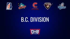
Matchup No. 1
The first matchup in the logo competition actually involves the franchise that won the DUBNetwork regular season jersey competition, the Seattle Thunderbirds.
The first WHL (WCHL) team to call Vancouver, British Columbia home was the Vancouver Nats. They played two seasons in the WCHL from 1971 – 1973. The team won 10 games in their first season and 17 in their sophomore year, placing them last overall in the league both years. In 1973 the team would relocate to Kamloops, British Columbia.
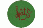
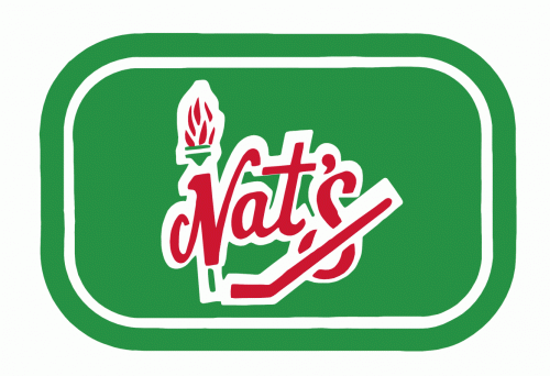
The Nats logo (if you want to call it that) is a simple wordmark with a torch and a hockey stick. The green circle is the original logo, I’ve added the other as a reference and for a better quality look at it. Very simple and very plain, however my guess is that in 1971 no one was paying much, if any, money to graphic designers for junior hockey logos.
When the franchise relocated to Kamloops in 1973 they were renamed the Kamloops Chiefs. They played 4 seasons in Kamloops before once again being relocated, this time to Seattle, Washington. They didn’t fare much better in their first year in the British Columbia interior, notching only 13 wins. They would manage 30+ wins in each of their other three seasons before relocating. Andy Moog, Ryan Walter, and Barry Melrose (who may be best known for having the greatest NHL coaches mullet ever) all dawned the Kamloops Chiefs logo before moving on the the NHL.
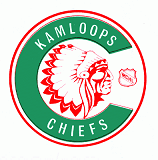
The green and red were kept from the Nats logo. The Indian chief dominates the interior of the C in what is a very nice logo for the 70s era.
[yop_poll id=”37″]
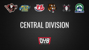
Matchup No. 2
After moving from Kamloops to Seattle in 1977 the Chiefs became the Seattle Breakers. The franchise would be known as the Breakers until 1985 when the team was sold and renamed the Thunderbirds. Through eight seasons the Breakers would win 225 games and play in the West Division Finals two times. Ken Daneyko may be the biggest name to have worn the Breakers jersey.
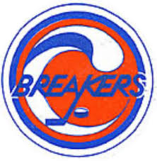
The Breakers would move away from the green and red of the previous teams to blue and orange. Breakers wordmark with a hockey stick and puck being enveloped by a breaking wave.
The Winnipeg Clubs would be the second team in the franchise that would eventually become the Lethbridge Hurricanes. In 1963 the Winnipeg Jets would begin play in the WCHL in 1967. In 1973 the nickname would be changed from the Jets to the Clubs to disambiguate themselves from the NHL Winnipeg Jets. The Clubs would play from 1973 until 1976, when they would once again be renamed without leaving the city of Winnipeg. While the franchise was the Clubs they would average just over 24 wins per season and only once make the playoffs.

I suppose it’s meant to be a club like the suit in a deck of cards with a W underneath it, however that’s not really what I see. Maybe someone can explain it a bit better to me. Please comment if you can.
[yop_poll id=”38″]
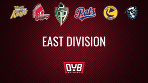
Matchup No. 7
The first version of the Edmonton Oil Kings opened up play in 1966 as one of the original founding members of the WHL. The original franchise actually dates back to 1951. The team would win back to back President’s Cup (now Ed Chynoweth Cup) titles in 1971 & 1972. With Edmonton receiving a pro WHA franchise the Oil Kings found it tough to compete and would move to Portland, Oregon in 1976 and become the Portland Winter Hawks. In 2009 the Winter Hawks would rename saying “the space…announced its retirement”, becoming the Winterhawks. In 1978 the Flin Flon Bombers would relocate to Edmonton and become the second incarnation of the Oil Kings. However, this version would only play one year in Edmonton before moving on to Great Falls, Montana. Notable players to wear the original Oil Kings logo include Pat Quinn, Johnny Bucyk, and Harold Snepsts (arguably the second greatest moustache in NHL history).
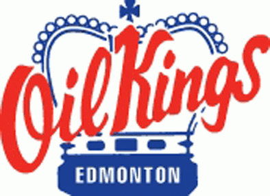
You’ll probably all recognize this logo, as it is very similar to the current EOK logo, just with much less colour. The original would stick with only red and blue and the crown would be shaped slightly different.
After version No. 2 of EOK left for Montana they would play less than a single season in Great Falls before once again relocating, this time to Spokane, Washington. The franchise would only play a season and a half in Spokane before folding, only 26 games into the 1981/82 season. The most interesting part of the Spokane Flyers may be the trade that they were involved in after the team folded: “After ceasing operations, the Flyers team bus was sold to the Victoria Cougars. The Cougars owners were not willing to pay the duties and taxes required to bring the vehicle into Canada, so on December 19, 1983, the Cougars traded the bus to the Seattle Breakers for holdout Tom Martin.”
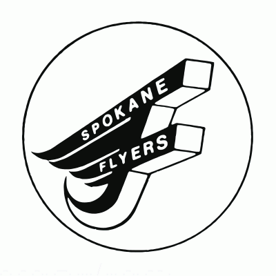
The Flyers logo is a flying F with the team name written on the F. I have also seen the logo in blue with the circle around the logo being blue with white stars inside. However, this version was a much better quality.
[yop_poll id=”39″]
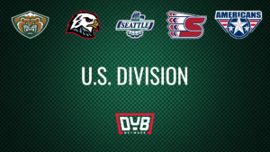
Matchup No. 8
The Nanaimo Islanders played in the WHL for one season 1982-83. They were the third relocation of the franchise that would eventually become the Tri-City Americans. In 1982 the Billings Bighorns would relocate to Vancouver Island and become the Nanaimo Islanders. The team played in Frank Crane Arena (which apparently would have been temporarily suitable for a WHL team almost 40 years later, this coming season, however the residents of Nanaimo voted against a plan for a new arena, keeping the Kootenay Ice in Cranbrook) for that one season and missed the playoffs. The team would move back to the mainland to New Westminster, British Columbia before settling in Kennewick, Washington. Mark Lamb, who would win a Stanley Cup with Edmonton in 1990, played in Nanaimo.
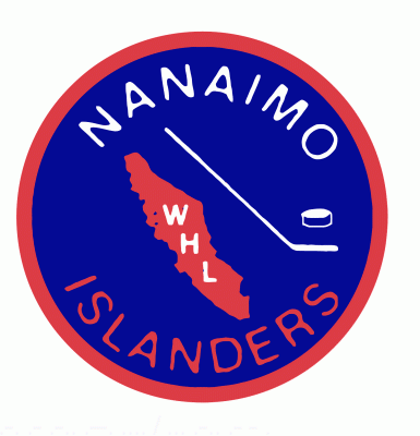
Like the New York Islanders the Nanaimo Islanders go with the blue orange combo with the island, stick, and puck. Just a much simpler logo.
The Great Falls Americans moved from Edmonton in 1979 and folded after only 28 games. They would relocate to Spokane but not have much luck their either as the franchise would fold completely in 1982.
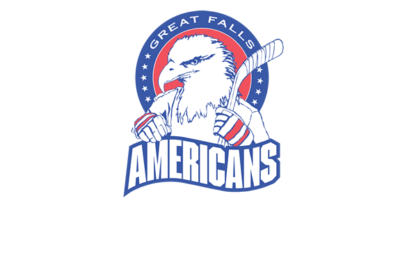
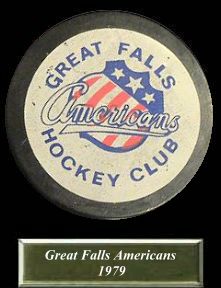
This logo I am not 100 per cent sure actually belongs to the Great Falls Americans of the WHL. It was the only one I could find. Please correct me if it wasn’t actually associated with the team in 1979. It was a pretty sweet logo though with the eagle in hockey gloves.
***UPDATE*** Thanks to Kevin Shaw (@theblueliner on Twitter) for informing us that this logo on the puck was the actual logo used by the Great Falls Americans in 1979
[yop_poll id=”40″]