Part 2 of Round One
Matchup No. 3
The WHL’s first franchise in Calgary, Alberta was the Calgary Buffaloes in 1966. The team would change it’s nickname to the Centennials the next season in 1967. The Centennials had some regular season success in the early 70’s finishing 1st in the West three times in five years. They would make their only trip to the league finals in 1974, only to be swept by the Regina Pats. In 1976 the team was sold and the franchise would relocate to Billings, Montana. Lanny McDonald would play six games for the Centennials before the Medicine Hat Tigers would acquire his rights.
![]()
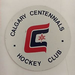
I have seen three different colours for the Centennials logo, one in all blue, one in all red, and one with blue and red. The logo features two C’s wrapped around a maple leaf made of triangles. It is a very strong representation of how simplistic many sports logos were in the late 60’s and early 70’s.
When the team moved from Calgary to Billings in 1977 they would change their nickname to the Bighorns, very fitting for a state known for its big horn sheep. The franchise would play five seasons in Billings at the MetraPark Arena (now known as the Rimrock Auto Arena at MetraPark). They would reach the playoffs in every season they played in Montana. They would play in the league final once, being swept by the first inception of the New Westminster Bruins (oddly enough this franchise would eventually become the second inception of the New Westminster Bruins). In 1982 the Bighorns would relocate once again, this time to Nanaimo, British Columbia. Recent WHL (Spokane) head coach Don Nachbaur played junior hockey in Billings.

This is one of those great classic logos. “Billings” fitting right between the curls of the big horn sheep’s horns. The red eyes of the sheep give it a somewhat ominous evil look. It may be one of the best logos this franchise with six different teams saw.
[yop_poll id=”42″]
Matchup No. 4
In 1976 the Winnipeg Clubs would change their nickname to Monarchs. This was the second nickname for the franchise, starting off as the Jets then changing to the Clubs, all while playing in Winnipeg. The Monarch nickname would last only a single season which saw the team finish 2nd in the Central with 31 wins. In 1977 the team would relocated to Calgary, filling the void left by the recently departed Centennials.

The Monarchs logo looks straight off a CFL helmet. A large W with the wordmark angled across it. Interesting enough the W would continue on to Calgary.
When the franchise moved to Calgary in 1977 they became the Calgary Wranglers. The team would play in Calgary for ten seasons, missing the playoffs three times. Playoff success however was at a minimum. They would play in the league final once, losing to the Victoria Cougars in seven games. The franchise would once again relocate in 1987, this time south to Lethbridge, Alberta, becoming the Hurricanes. This would leave Calgary without a WHL franchise for eight years before the expansion Hitmen would arrive. Conn Smythe winner Mike Vernon played junior hockey for the Wranglers, twice winning the WHL MVP award.
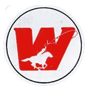
As voted in by you fans the W logo represents the Calgary Wrangers in this competition. The large W hold over from the Winnipeg days changes colour to red (like nearly every Calgary team) this time fronted by a cowboy on his horse lassoing the corner of the W. Horses and cowboys seem to be synonymous with Calgary so this is very fitting.
[yop_poll id=”43″]
Matchup No. 5
One of the founding members of the WHL in 1966 was the Estevan Bruins. Originally founded as the Humboldt Indians the team moved to Estevan in 1957. The team would play five seasons in the WHL winning the championship in 1968. In 1971 the franchise would move to New Westminster, British Columbia and become the first edition of the New Westminster Bruins. The Estavan Bruins still exist today, now playing in the Saskatchewan Junior Hockey League (SJHL)
![]()
It’s a Bruins logo, just like all other Bruins logos. A bruin, being a bear, gives so many options for a logo, yet every Bruins team seems only to adopt the spoke logo. It’s a classic look for sure, but one that has been used far too often.
The Broncos franchise started in Swift Current, Saskatchewan in 1967. However, with the team losing money the franchise would move to Lethbridge in 1974 to play in the newly built Lethbridge Sportsplex (now Enmax Centre). In all 12 years in Lethbridge the fans would see their team play playoff hockey, including winning the WHL Championship in 1983 by beating the Portland Winter Hawks in five games. The Broncos would finish 4th at the Memorial Cup, watching the team they beat in the WHL Final win at home in Portland. In the mid 80’s the team would go up for sale and despite the success in Lethbridge the team was purchased by interests in Swift Current who would move the franchise back to it’s original location. One of hockey’s most famous families in the Sutters saw all six brothers play for the Lethbridge Broncos.
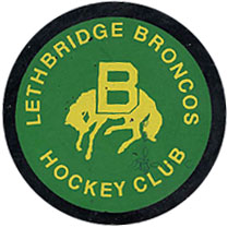
It almost feels as if this logo shouldn’t be in this ‘defunct’ competition, as the current Broncos team in Swift Current does still use their version of the logo with ‘SC’ instead of ‘B’ above the bucking bronco. Swift Current has adopted a blue and green colour scheme, while Lethbridge had used a yellow and green scheme.
[yop_poll id=”44″]
Matchup No. 6
Estevan relocated to New Westminster in 1971 keeping the Bruins nickname. This first version of the NW Bruins would have a very successful run, winning four straight WHL Championships from 1975 to 1978, including winning back to back Memorial Cups in 1977 and 1978. In 1981 this franchise would move to Kamloops, British Columbia.
In 1983 the Nanaimo Islanders would move back to the mainland and become the second version of the NW Bruins. From Calgary, to Billings, to Nanaimo, to New Westminster, and eventually on to Kennewick, Washington, becoming the Tri-City Americans. The second inception of the Bruins would not quite have the same success as the first, missing the playoffs in two of the five seasons in New Westminster before relocating. Glen Hanlon, Mark Recchi, Bill Ranford, and Stan Smyl are a few of the players that have gone on to great careers after playing in New Westminster.
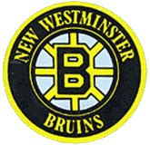
I must say I was a bit disappointed that this is the logo to represent the NW Bruins and not the one with the paw, but the fans have SPOKEn. Not much else to say about this Bruins logo that hasn’t already been said.
When the first version of the NW Bruins moved to Kamloops they became the Kamloops Junior Oilers. They would play as the Junior Oilers three seasons before changing their nickname to the current Kamloops Blazers. The franchise would win one league championship while under the name Junior Oilers. This franchise has been one of the most successful in WHL history. Between Estevan, New Westminster, and Kamloops the franchise has won a total of 11 WHL Championships and five Memorial Cups.

Nearly identical to the Edmonton Oilers logo, with the colours reversed and ‘Kamloops’ put in the bottom of the oil drip. The Blazers dawned this logo as an alternate in the 2011/12 season.
[yop_poll id=”45″]
LAST WEEKS RESULTS:
[yop_poll id=”37″][yop_poll id=”38″]
[yop_poll id=”39″][yop_poll id=”40″]